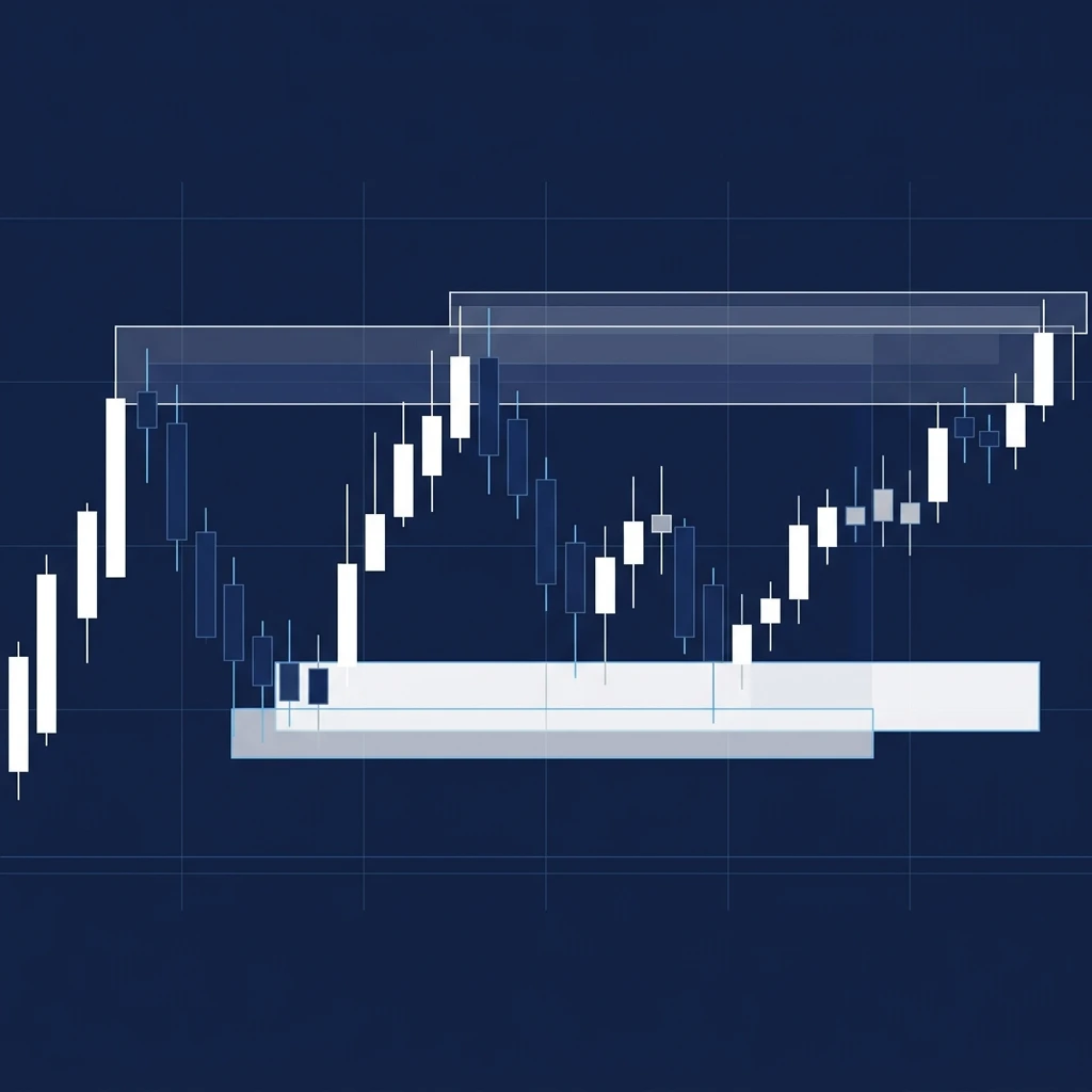
Most retail traders spend months chasing indicators before discovering that the most useful levels on any chart are the ones price created itself. Supply and demand zones — the specific price areas where institutional orders were placed and partially left unfilled — sit quietly on the chart long after the candle that formed them has scrolled off the screen.
When price returns to those areas, something interesting nearly always happens.
This guide is a practical walkthrough of the supply and demand trading strategy: how to identify valid zones, how to enter with a defined risk, and how to know when a zone is no longer worth trading. I'll include worked examples with real pip counts so you can follow the logic rather than just the concept.
What Supply and Demand Zones Actually Are
A demand zone is a price area where buyers overwhelmed sellers so decisively that the price moved away sharply, typically leaving a short-base-short or drop-base-rally pattern on the chart. A supply zone is the mirror image: price consolidated briefly, then fell fast, leaving unfilled sell orders in that range.
The core idea behind demand and supply trading is that those unfilled orders remain resting in the market. When the price retraces to that area, those orders get hit again, and the price reacts. This is why a strong zone can hold through multiple tests across weeks or even months.
Not every consolidation qualifies. For a zone to be worth marking, I want to see a strong impulse move leaving the base — a move that's noticeably larger than the candles inside the base itself. If the price drifted away slowly, there's nothing special about that area. The impulse is what tells you institutional size was involved.
How to Draw Zones Correctly (Without Overcomplicating It)
There are three elements I check before I draw anything:
- The base. This is the consolidation itself — usually two to five candles, sometimes as few as one. I draw the zone from the low of the base (for demand) or the high of the base (for supply) to the first candle that closed aggressively in the direction of the impulse.
- The impulse. The move leaving the base should cover at least two to three times the height of the base itself. If the ratio is lower than that, I pass.
- The freshness. A zone that price has already retraced into and closed through is spent. I only trade zones; the price has not yet been revisited since they formed.
On a daily EUR/USD chart, for example, you might mark a demand zone between 1.0710 and 1.0755 — a 45-pip base where price consolidated for three days before moving up 180 pips in two sessions. That 4:1 ratio qualifies. If price retraces to 1.0730 in a future session, that's where I'm watching for a reaction.
Entering Trades at Supply and Demand Zones
There are two common entry approaches and I use both depending on the timeframe and context.
The limit entry places an order at the top of a demand zone (or the bottom of a supply zone) before the price arrives. You don't get confirmation, but your entry is cleaner, and your stop is tighter. For the EUR/USD example above, a limit at 1.0755 with a stop at 1.0705 gives you a 50-pip risk.
The confirmation entry waits for a reaction candle inside the zone — a strong pin bar, an engulfing, or a rejection wick — then enters on the close or the next open. You sacrifice some of the R-multiple, but you have evidence that the zone is holding.
If that same EUR/USD zone produces a bullish engulfing at 1.0720, you might enter at 1.0725 with a stop at 1.0700 — 25 pips of risk, still well within the zone.
Target placement for demand and supply trades should reach at least the next supply zone, not just a round number. If the next meaningful supply sits at 1.0930, that's a potential 205-pip gain from a 25-pip risk — roughly an 8R trade. Not every setup offers that, but the principle holds: let the next zone define your exit.
Why Most Traders Fail at This Strategy
The most common mistake I see is trading zones that have already been tested. A zone that held three weeks ago and the price has now wicked into twice is structurally weakened. Each time a price visits, some of those resting orders get filled, and the zone loses depth.
A first-touch zone on a fresh supply area is a fundamentally different trade than a third-touch attempt.
The second mistake is drawing zones on one timeframe and placing stops sized for a different one. If you identify a zone on the daily chart, your stop needs to be sized for daily candle volatility — not a 10-pip stop that any normal hourly fluctuation will hit.
I've seen traders blow out perfectly good zone reads simply because they undersized their stops relative to the timeframe. Use a position size calculator to work out your lot size after you've placed your stop correctly, not before.
The third mistake is ignoring the broader structure. A demand zone that sits inside a larger supply zone on the weekly chart is a low-probability trade. Always check one timeframe higher before committing.
Tracking Zones With a Trading Journal
Here's something I've found genuinely useful: the supply demand zones that work consistently for you are often the same types of zones — a specific pattern, a specific timeframe, a specific session. You can only discover that by logging enough trades to see the pattern.
For years, I tracked this manually in a spreadsheet. The problem is that spreadsheets don't show you equity curves, don't let you tag setups, and don't calculate your profit factor across a filtered subset of trades. Once I started using a dedicated forex trading journal, I could see which zone types were actually working and which ones I was trading out of habit.
Edgelog is free — no trial, no credit card, unlimited trades — and the setup tag and session breakdown features are specifically useful for supply and demand traders. You can tag every trade with your zone type (fresh demand, tested supply, institutional base, etc.), then filter by tag to see your win rate and expectancy on each.
If your fresh-demand trades are running at a 2.1 profit factor but your tested-supply trades are barely breaking even, that's information worth having.
MT4 and MT5 traders can sync trades automatically via the free EdgelogSync Expert Advisor, so there's no manual logging after the initial setup. Binance and Bybit are supported via read-only API keys. Everything else imports via CSV.
You can also run your numbers through the standalone profit factor calculator or win rate calculator if you want a quick sense of where a batch of trades stands before committing them to your journal.
At the time of writing, paid alternatives like TradeZella, TraderSync, and Tradervue all cap trades or require a subscription at their entry tiers.
Zones Don't Work Until You Know Which Ones Work For You
The supply and demand trading strategy is one of the cleaner frameworks I've used — it's grounded in order flow logic, it works across forex and crypto, and the zones are visible on any plain price chart without a single indicator. But it still takes time to calibrate.
Some traders do best on daily zones and ignore everything intraday. Others find the four-hour chart in the London–New York overlap gives them the cleanest reactions. There's no universal answer, and anyone who tells you otherwise is selling a course. The answer lives in your own trade history.
That's the actual argument for journaling every supply and demand zone trade you take — not to feel disciplined, but to gather the data you need to answer the question: which exact setup is your edge, and how big is it?
If you haven't started logging yet, open a free Edgelog account and tag your first ten zone trades this week. Ten trades won't tell you much, but it's the only way to get to the hundred that will.